Use Cases
Real-world scenarios where TrendCast helps you spot trends before they move markets.
TrendCast shines when you need to connect what’s happening on social media and in the news with what prediction markets are pricing. Here are the most common use cases — each with a screenshot from the live UI.
1. Spot a viral crypto post and check market odds
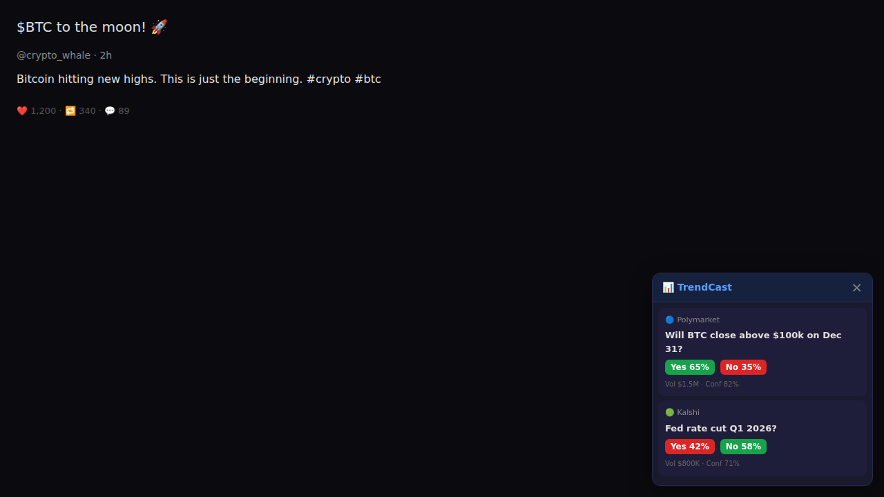
You’re scrolling X and see a viral post about Bitcoin hitting new highs. TrendCast’s odds overlay appears in the corner showing the correlated Polymarket contract (“Will BTC close above $100k?”) with live Yes/No odds.
How it works
The content script on x.com scrapes the post text,
extracts keywords (btc, bitcoin), and the
correlation engine matches them to active market contracts. The overlay
shows the top matches with confidence scores.
You instantly see: Yes 65% · Vol $1.5M · Conf 82% — without leaving X.
2. Morning routine: check the dashboard
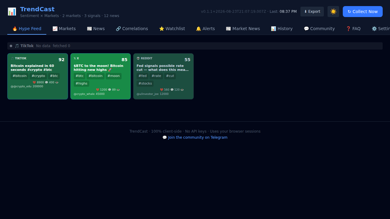
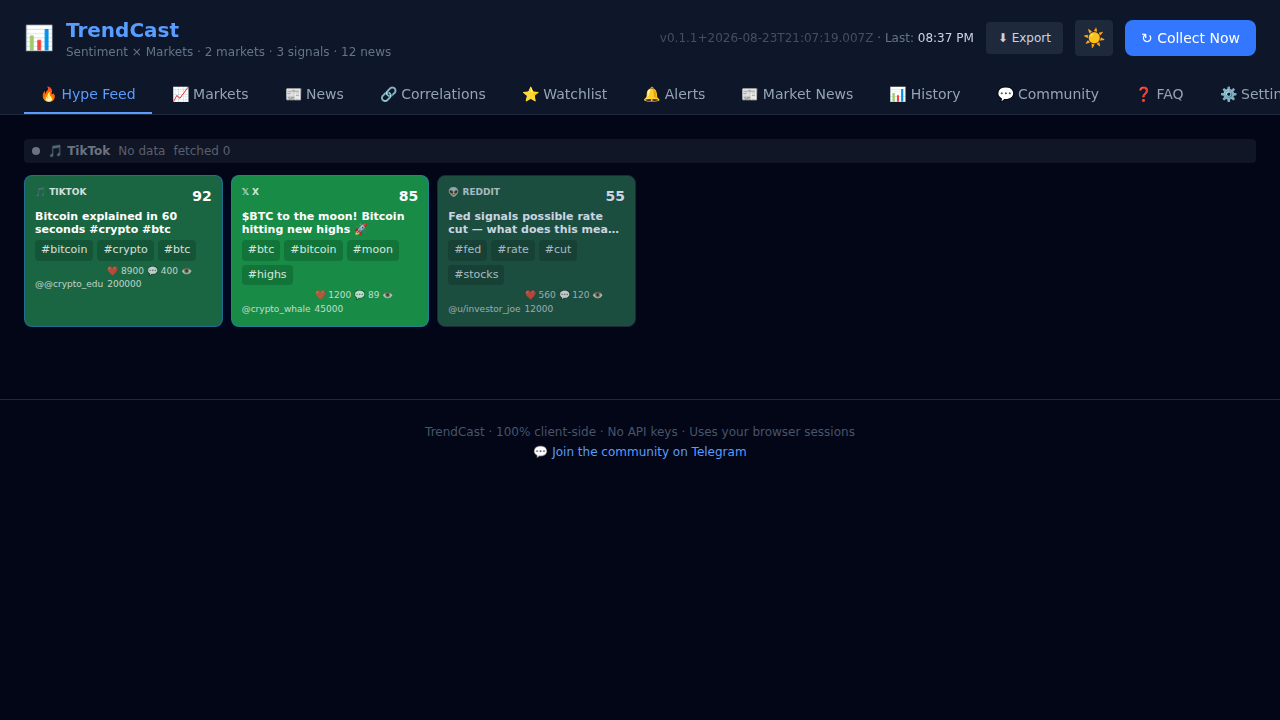
You open a new tab and see the full Hype Feed — all trending social signals sorted by virality, with sentiment-coloured tiles. You immediately know what’s hot today.
What you see
The default tab shows cards from X, Reddit, and TikTok. Green tiles = bullish sentiment, red = bearish. The top card has a virality score of 92 (a TikTok about Bitcoin). Engagement metrics (likes, comments, views) are shown on each card.
3. Scan prediction market opportunities
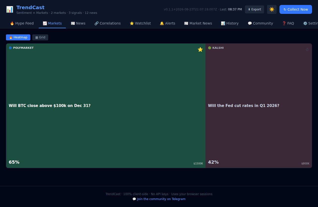
Switch to the Markets tab to see a treemap of all active Polymarket and Kalshi contracts. Tile size = volume, colour = Yes probability. Big green tiles = high-volume, high-Yes markets.
Reading the treemap
The BTC market tile is large (high volume) and green (65% Yes). The Fed rate cut tile is smaller and red (42% Yes). Star a market to add it to your watchlist for tracking.
4. Correlate news with market moves
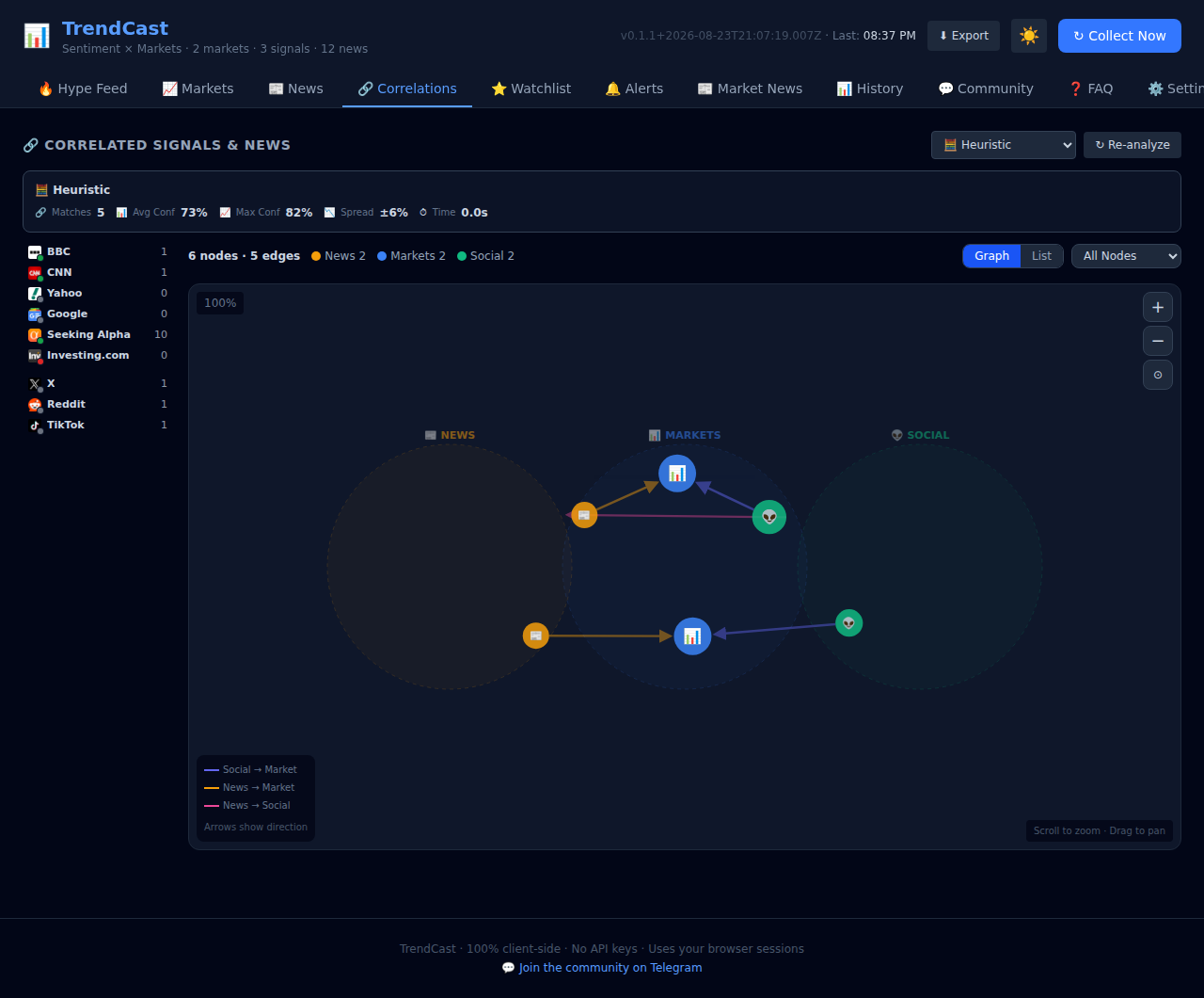
A BBC headline about Bitcoin surging past $98k — does that correlate with the Polymarket BTC contract? The Correlations tab shows a network graph connecting news → markets → social signals.
The network graph
Nodes represent news items (📰), market contracts (📊), and social signals (👽). Directed edges show causal flow. The BBC headline connects to the BTC market with 76% confidence, and to the X post with 65% confidence.
Switch between 6 correlation engines to compare results.
5. Track your watchlist over time
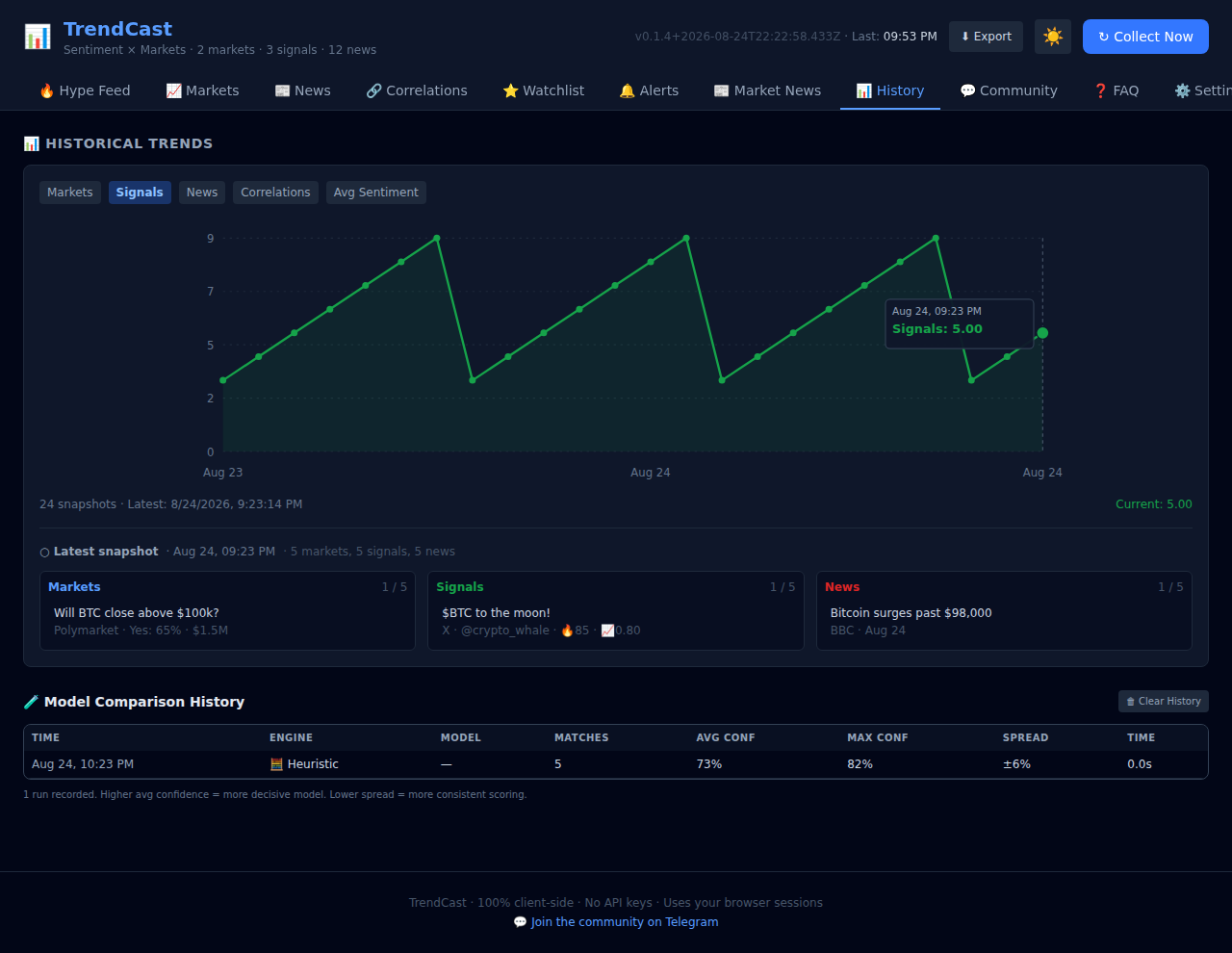
You starred the BTC $100k market last week. Now you open the Watchlist tab to check its status, then switch to History to see how market and signal counts have trended over the last 24 hours.
Historical trends
The History tab shows an SVG line chart with a metric selector. Hover over any point to see exact values and a detail panel with the top markets, signals, and news from that collection snapshot.
6. Quick check from the toolbar popup
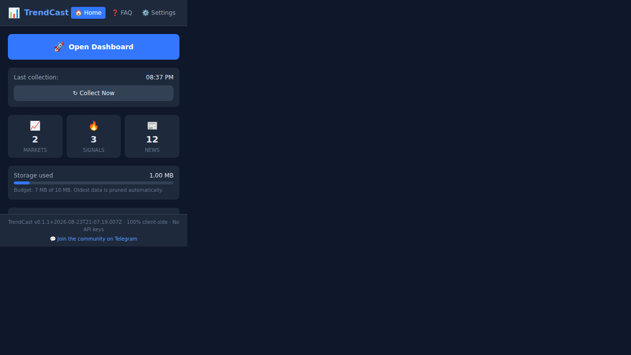
You don’t want to open a full tab — just a quick glance. Click the TrendCast toolbar icon to see the popup with quick stats, Collect Now button, and active source badges.
Popup quick-launcher
The 380px popup shows markets/signals/news counts, a storage usage bar, and badges for all enabled sources. Click Open Dashboard for the full view, or Collect Now to trigger an immediate collection cycle.
7. Switch to light mode
Prefer a bright interface? Toggle the theme in the header. The setting persists across sessions.
Light mode
The theme toggle (☀️ / 🌙) in the header switches between dark and
light mode instantly. Your preference is saved to
chrome.storage.local and applied on every new tab.
8. Export data for analysis
Want to pull the data into a spreadsheet or notebook? Use the Export dropdown in the header to download CSV or JSON.